 Back
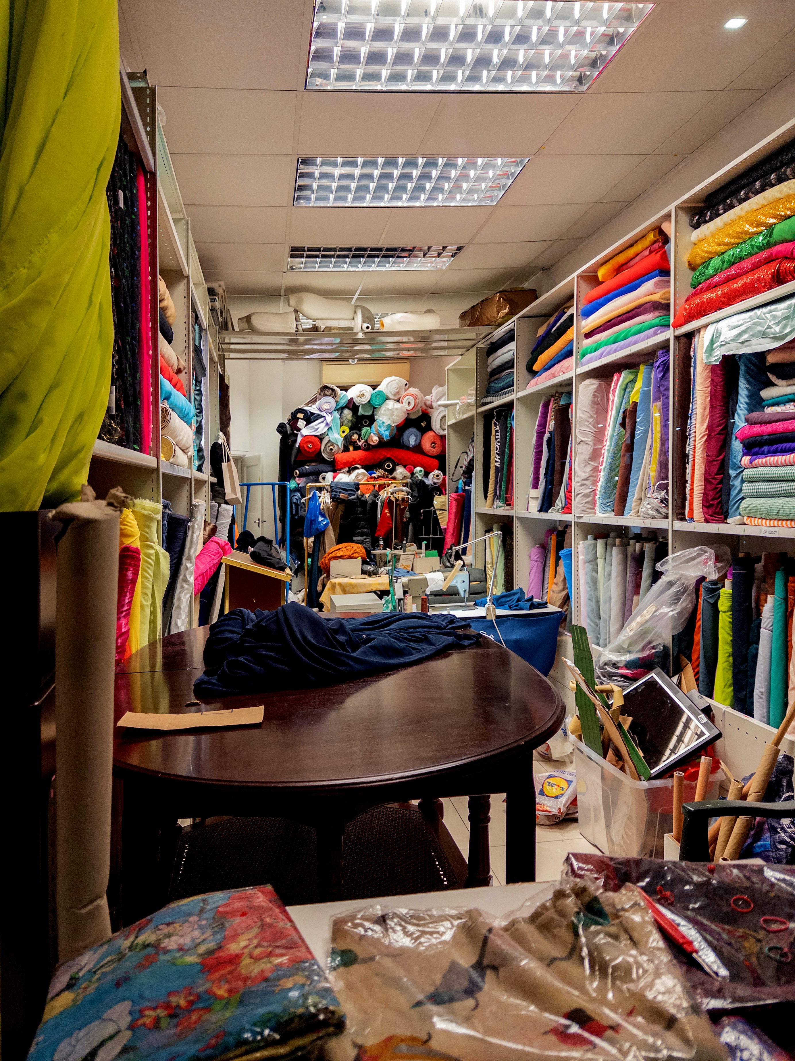
Reducing repetitive work and uncertainty at the checkout counter
As the sole designer, I redesigned product entry, quantity and pricing controls, and payment confirmation. The approach automated routine calculations while preserving the flexibility cashiers needed for products sold by meter or piece and special prices.
- Scanning: 7 steps → 3
- Payment: 7 steps → 4
Step counts, not time
Product context
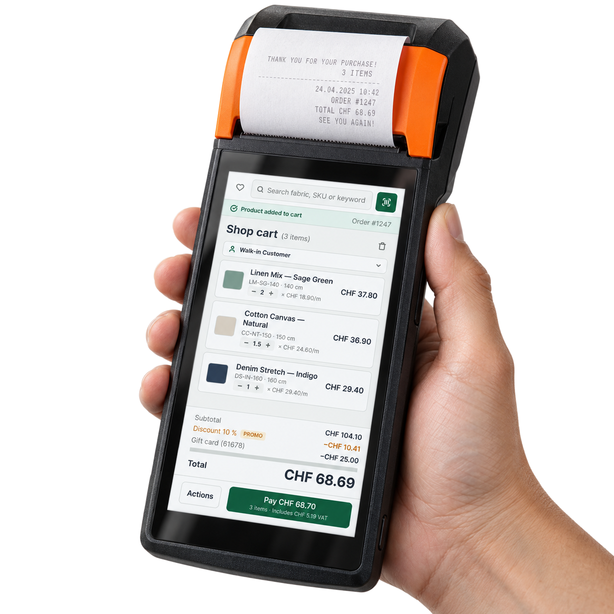
Pompon gives fabric-shop cashiers the flexibility to check prices and take payments through a mobile device. Their work involves products sold by meter or piece, items without barcodes, and flexible pricing. The business analyst’s field observations suggested that mobile checkout was slower than the desktop workflow. The redesign focused on making the mobile workflow : removing repeated entry and manual calculation while preserving control over quantities.
- ROLE
- Senior Product Designer (sole designer) Research, problem framing, prioritization, interaction and interface design, design system components, prototyping, usability testing, developer collaboration, QA.
- SCOPE
- Product search and scanning, Favorites, quantity and pricing controls, and payment confirmation.
- TEAM
- 1 designer, 1 developer, 1 business analyst
- DURATION
- 2-month redesign + later live-product discovery and QA
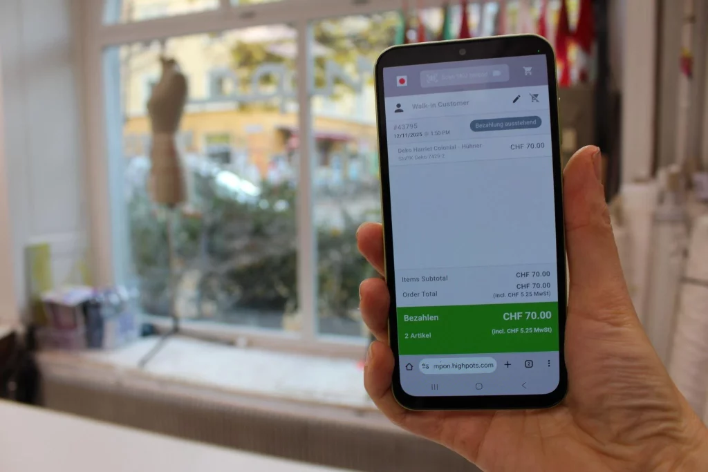

THE REAL CONTEXT OF USE
Cashiers need product information during customer enquiries, as well as tools to complete a sale.
Customers ask whether a fabric is in stock, how much is available, and what it costs. Cashiers use Pompon to answer these questions alongside scanning products, adjusting quantities, and taking payments. Product lookup therefore needed attention as a core task alongside checkout.
DISCOVERY & PRIORITIZATION
How evidence shaped the redesign priorities
I combined the business analyst’s field observations with a desktop POS comparison, a review of the mobile flows, and the shop’s operating practices. Together, these revealed three priorities: reduce repeated input, remove routine calculation from the cashier’s work, and make payment completion clear.
| Source | Finding | implication |
|---|---|---|
| Business analyst’s field observations | Mobile checkout appeared slower than desktop checkout. | Investigate where the mobile workflow introduced friction. |
| Desktop POS comparison | The mobile flow required additional choices. | Review which choices were necessary during repeated tasks. |
| My mobile flow review | Scanning required mode switching and camera selection; payment completion was unclear. | Give scanning direct access and make the completion state explicit. |
| Shop practice | Products had different units, some lacked barcodes, and prices needed flexibility. | Support saved products, unit-specific entry, automatic totals, and editable prices. |
Four problems interrupted the cashier’s workflow
The review identified four problems across product entry, quantity calculation, and payment completion.
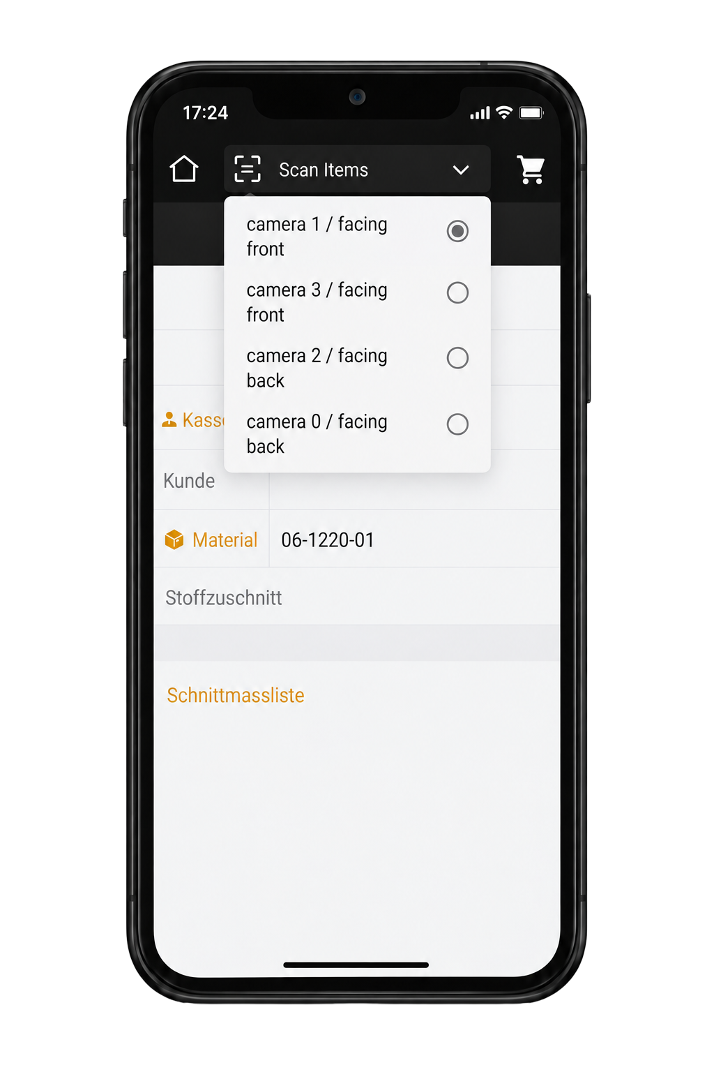
Scanning required unnecessary choices
Problem: Scanning shared one control with search, so every scan meant switching modes and choosing a camera.
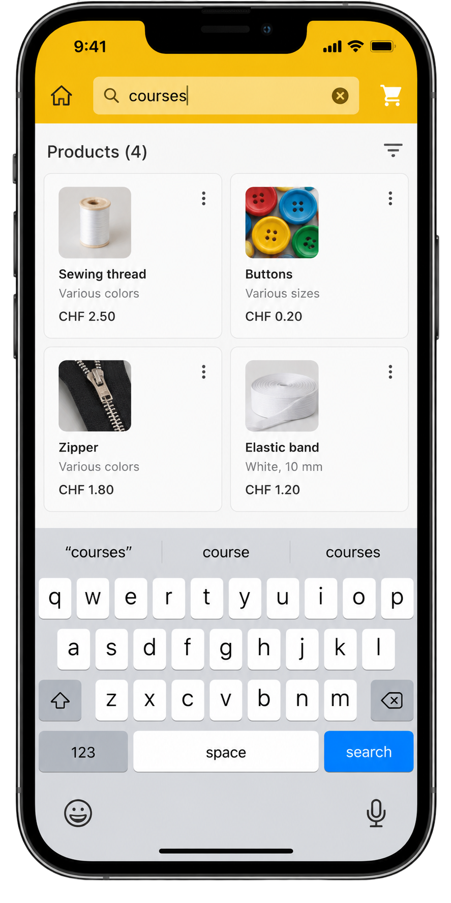
Barcode-free products required repeated typing
Problem: Some products, such as the shop's courses, have no barcode, so cashiers typed the name every time.
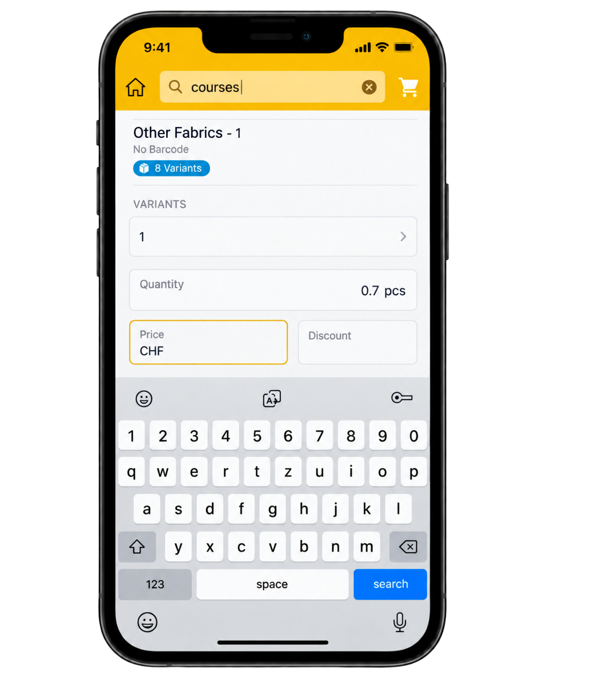
Totals calculated by hand
Problem: The total did not update when the meter count changed, so cashiers worked it out manually.
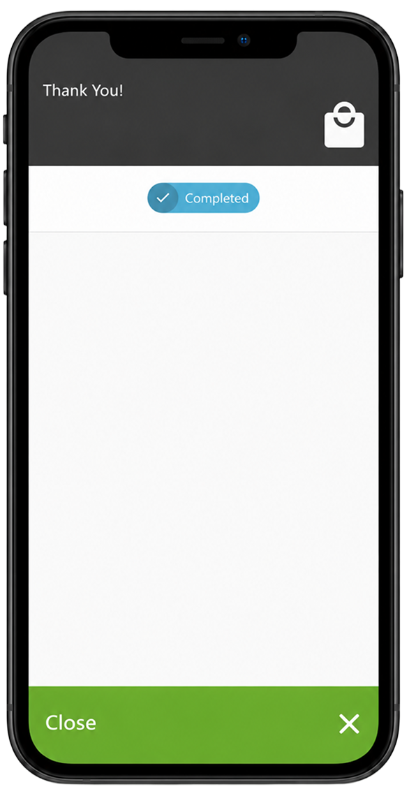
Payment ended without a clear confirmation
Problem: The completion screen did not clearly show success and closed quickly, so cashiers were unsure the payment had gone through.
WHERE THE EXISTING CHECKOUT FLOW SLOWED STAFF DOWN
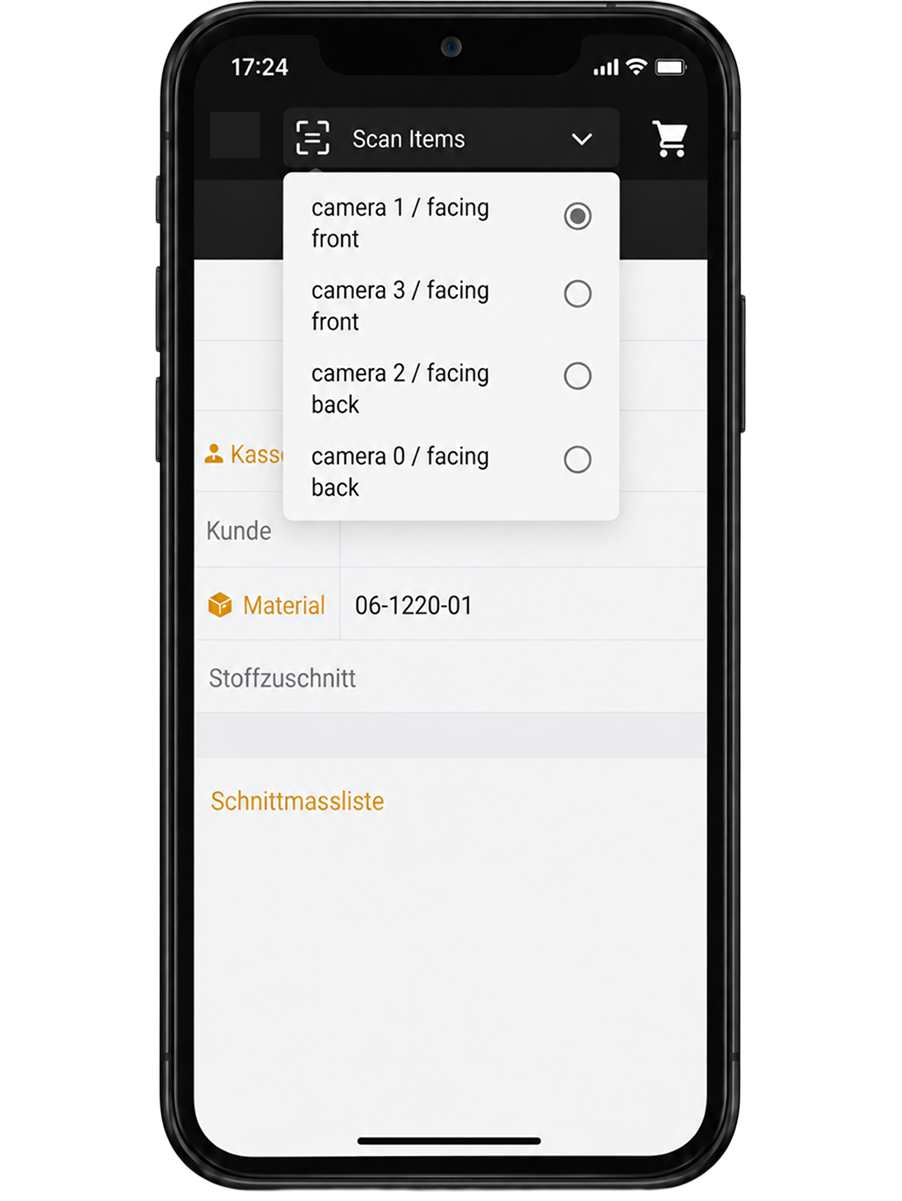
I mapped the barcode scanning and manual search paths to pinpoint friction. The map revealed three issues in the scanning path: the scanner was hidden inside Search, opening it took an extra tap, and staff had to choose the camera again for every scan.
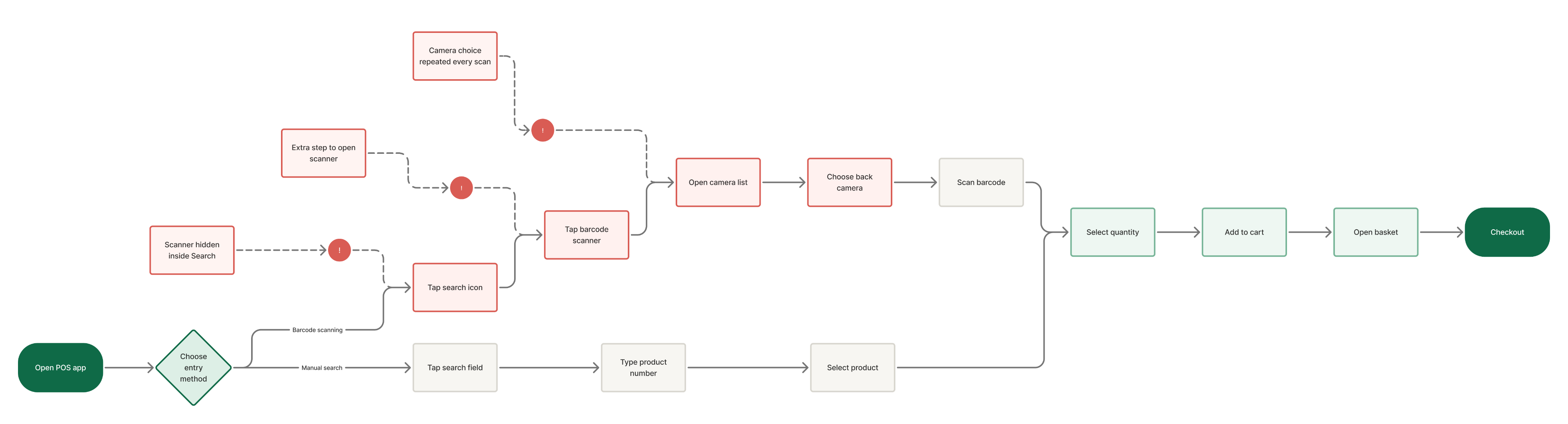
Scanning was hidden behind search
Start scanning without switching modes or choosing a camera.
Root cause
Search and scanning shared one control. Scanning required switching modes and choosing a camera on every scan.
Decision
I separated scanning from search with a dedicated Scan action and made the rear camera the default. Other cameras remained available through Settings > Account.
Rationale
I treated camera selection as configuration rather than a choice required for every item. This removed repeated setup from the scanning path while retaining flexibility for cashiers who needed another camera.
TRADE-OFF
Changing cameras now requires opening Settings, adding effort for that exception. The default scanning path stays direct, while alternative camera selection remains available.
Workflow change
Direct scanning
A dedicated Scan action removes mode switching and camera selection from the default path.
Before
- Open POS
- Search
- Scanner
- Camera list
- Select camera
- Scan
- Complete

After
- Open POS
- Scan
- Complete
Products without barcodes forced cashiers to type
Retrieve frequent products without retyping their names.
Observed
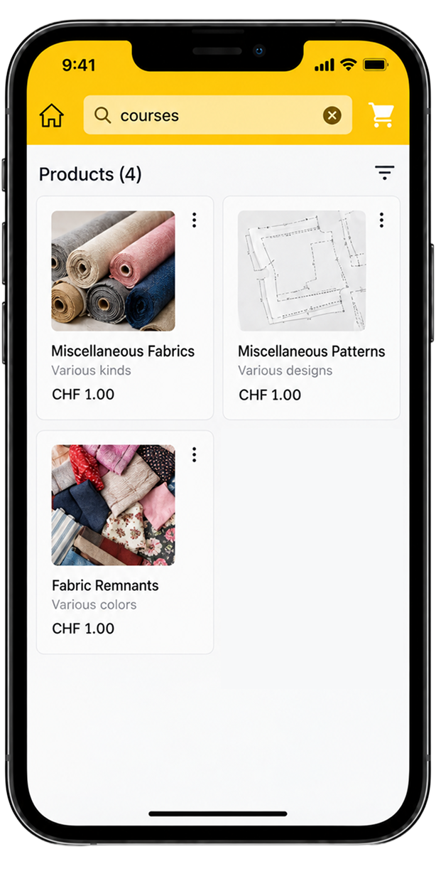
Some products, such as the shop's courses, have no barcode. Cashiers typed the product name every time.
Rationale
For frequently reused products without barcodes, scanning could not replace repeated typing. Saved access offered a way to retrieve those products without entering their names again.
Decision
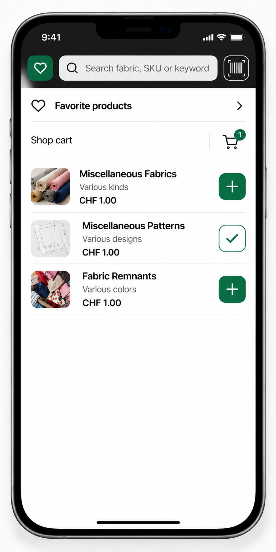
I introduced Favorites so cashiers could save frequently used products and retrieve them from the header. Cashiers chose which products to save, keeping the shortcut relevant to their work.
Trade-off
I reassigned the header space occupied by the shop logo to Favorites, prioritizing product retrieval over persistent branding. The shortcut required cashiers to save products before benefiting from it.
| Shop situation | Control |
|---|---|
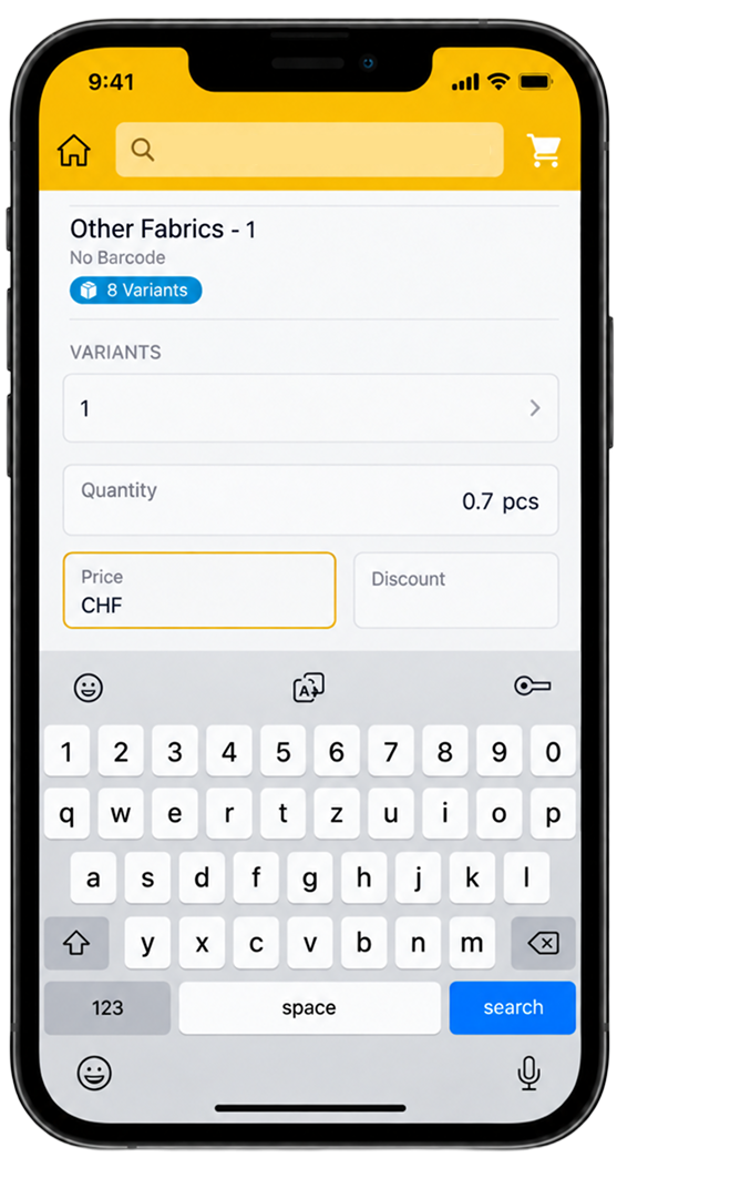
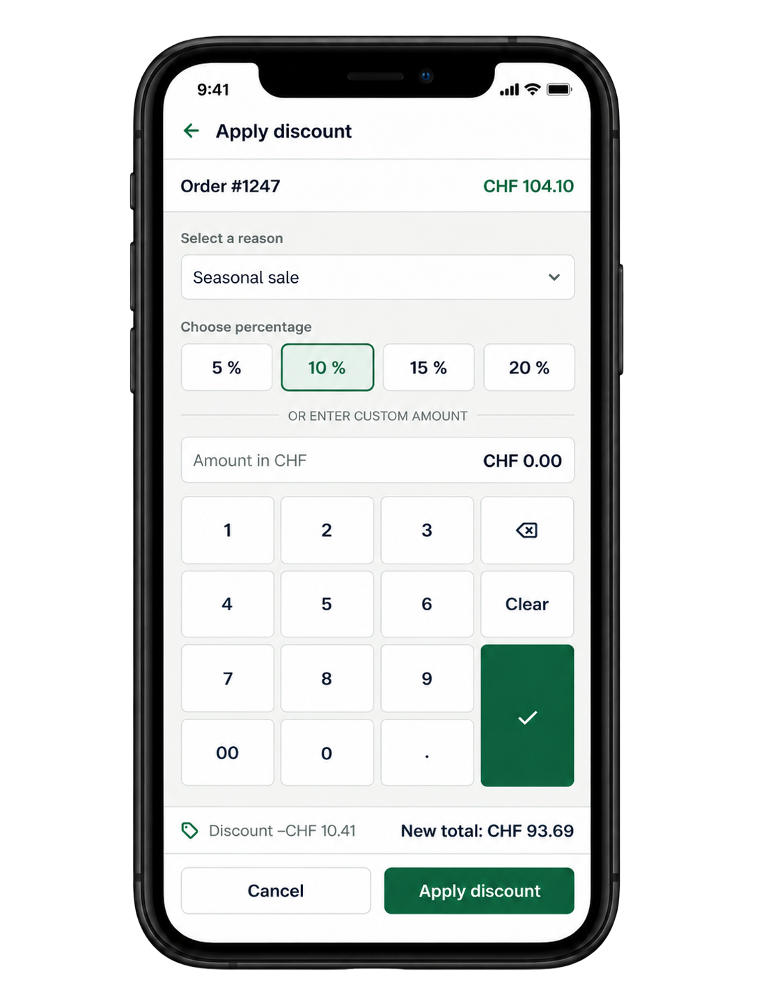
| Standard discount | Preset percentages: 10 / 15 / 20 / 30% |
| Rounding or special price, such as 121 → 120 | Editable price |
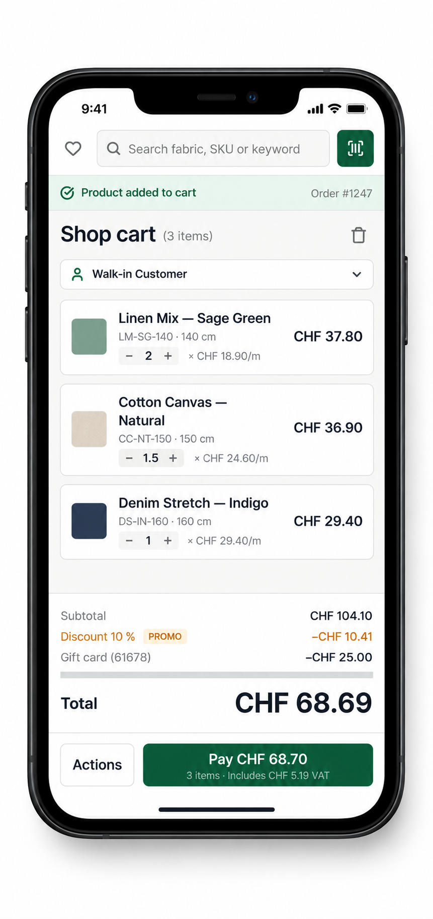
| Adjusting a purchase to a customer’s budget | Quantity adjustment with automatic total recalculation |
Automatic totals with control over special prices
Start scanning without switching modes or choosing a camera.
Observed
The total did not update when the meter count changed. Cashiers calculated it by hand.
DECISION
I agreed the automatic-total behavior with the developer and business analyst. Totals recalculate when quantity changes, while cashiers retain control over prices and discounts.
Rationale
The shop needed reliable calculation without rigid pricing. Automating the arithmetic removed manual work, while editable prices supported rounding and special agreements with customers.
Trade-off:
Supporting presets, editable prices, and quantity adjustments adds controls for cashiers to understand. Each adjustment needs a clear effect on the total so flexibility does not create pricing uncertainty.
Payment ended without a clear confirmation
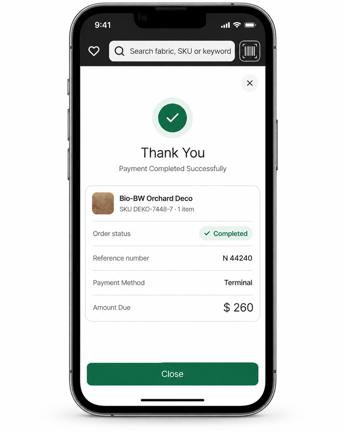
Make payment success clear before the cashier moves to the next sale.
Observed
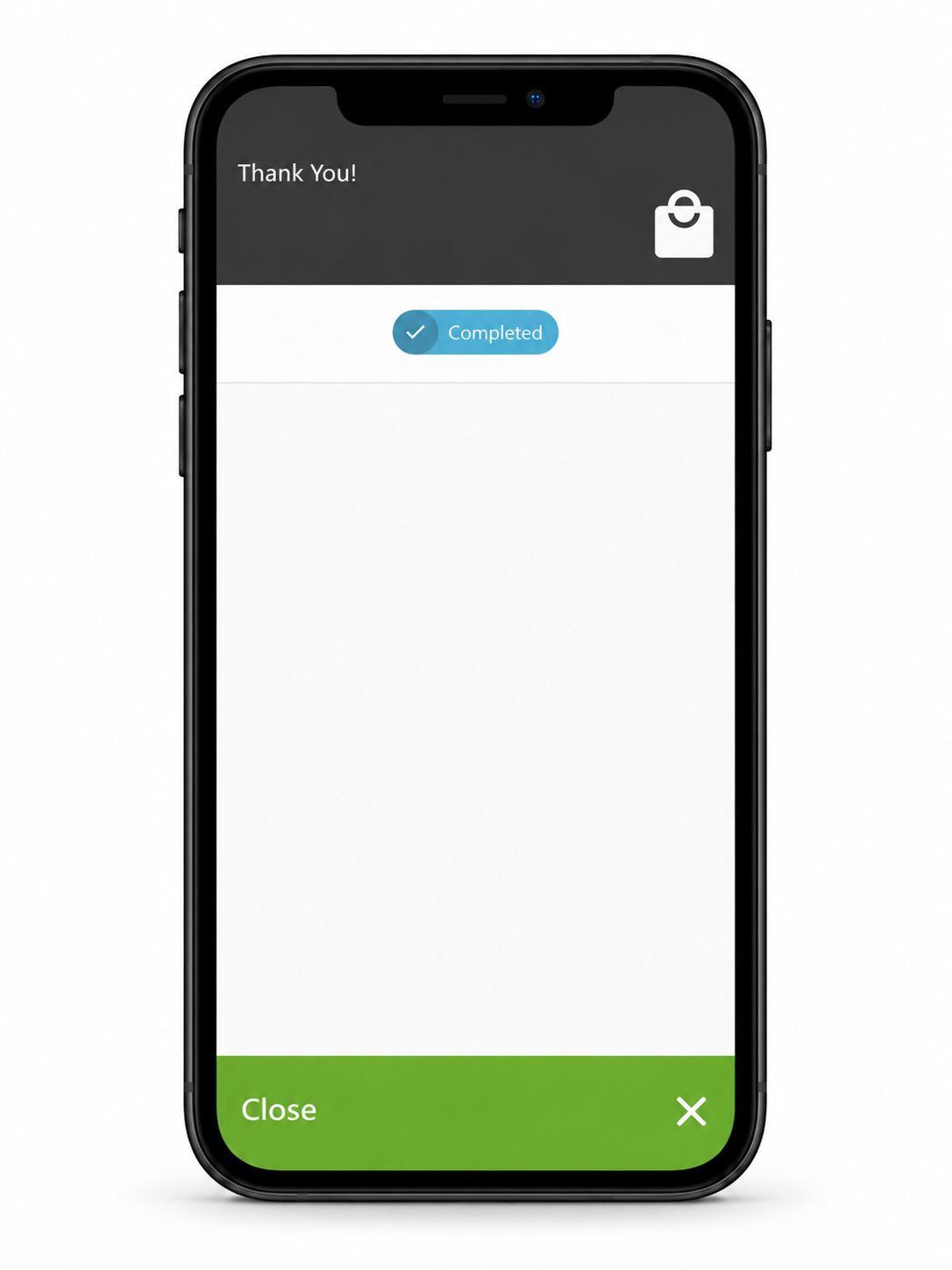
The old completion state closed quickly and did not clearly communicate payment success. Cashiers were unsure whether the transaction had completed.
Decision
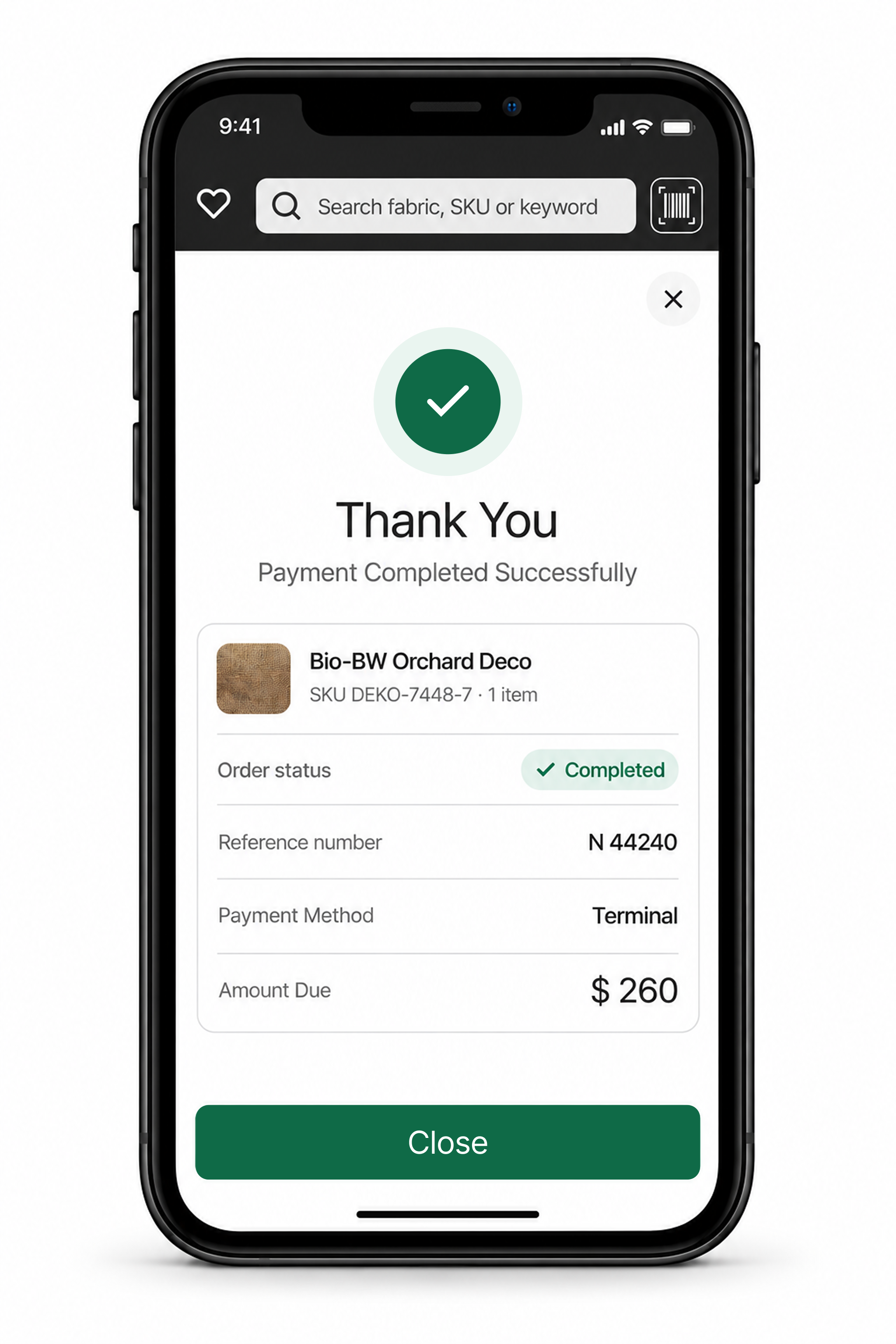
I designed a completion state combining an explicit success message with the amount, order ID, payment method, receipt actions, and the next-sale action.
Rationale
The confirmation needed to communicate both payment status and transaction identity. Cashiers needed to know that payment succeeded and which sale had completed.
Refining the interface for counter use
I refined text contrast and touch areas to support readability and repeated interaction at the counter.
CONTRAST
Problem: Light text had weak contrast against light backgrounds.
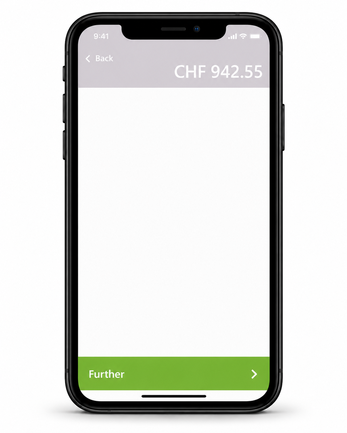
Decision: I increased text–background contrast to make information more legible.
TAP TARGETS
Problem: Some touch areas were smaller than their visible controls.
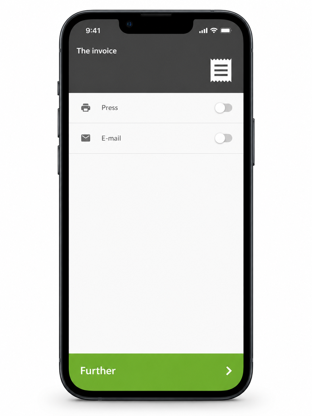
Decision: I expanded the interactive areas without increasing the controls’ visual size.
REMOVING UNIT CALCULATIONS FROM THE CASHIER’S MEMORY
Observed
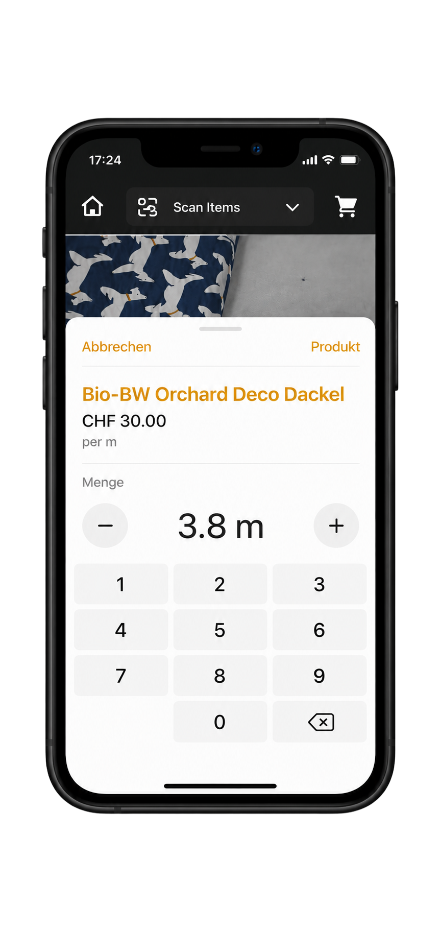
The existing workflow required cashiers to apply different calculation rules for products sold by meter or piece.
Decision
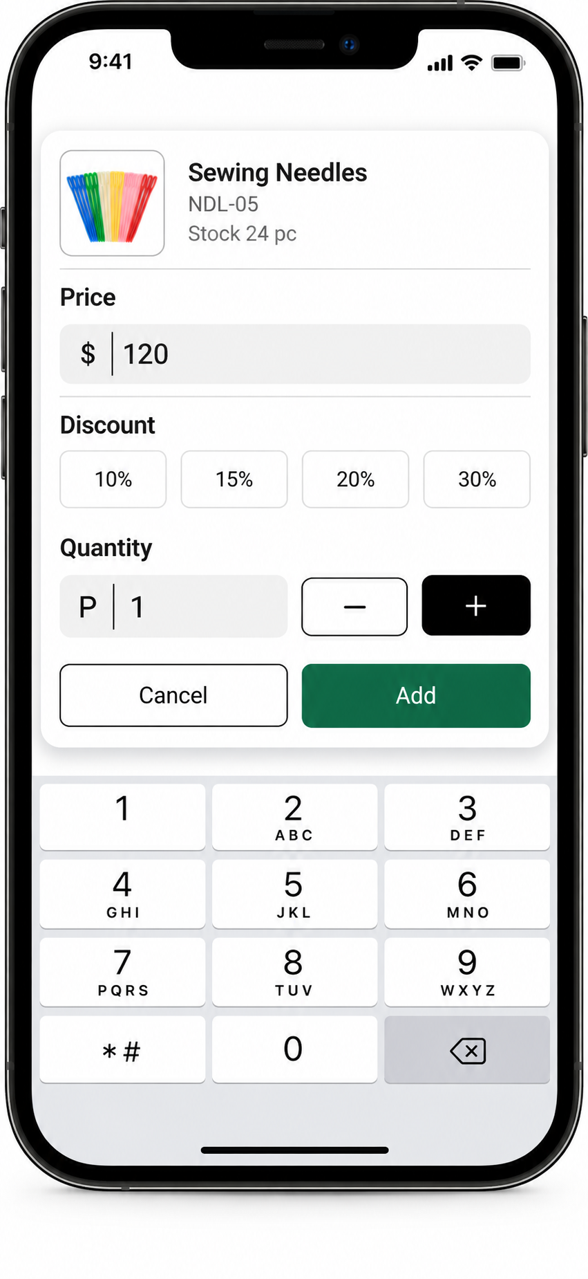
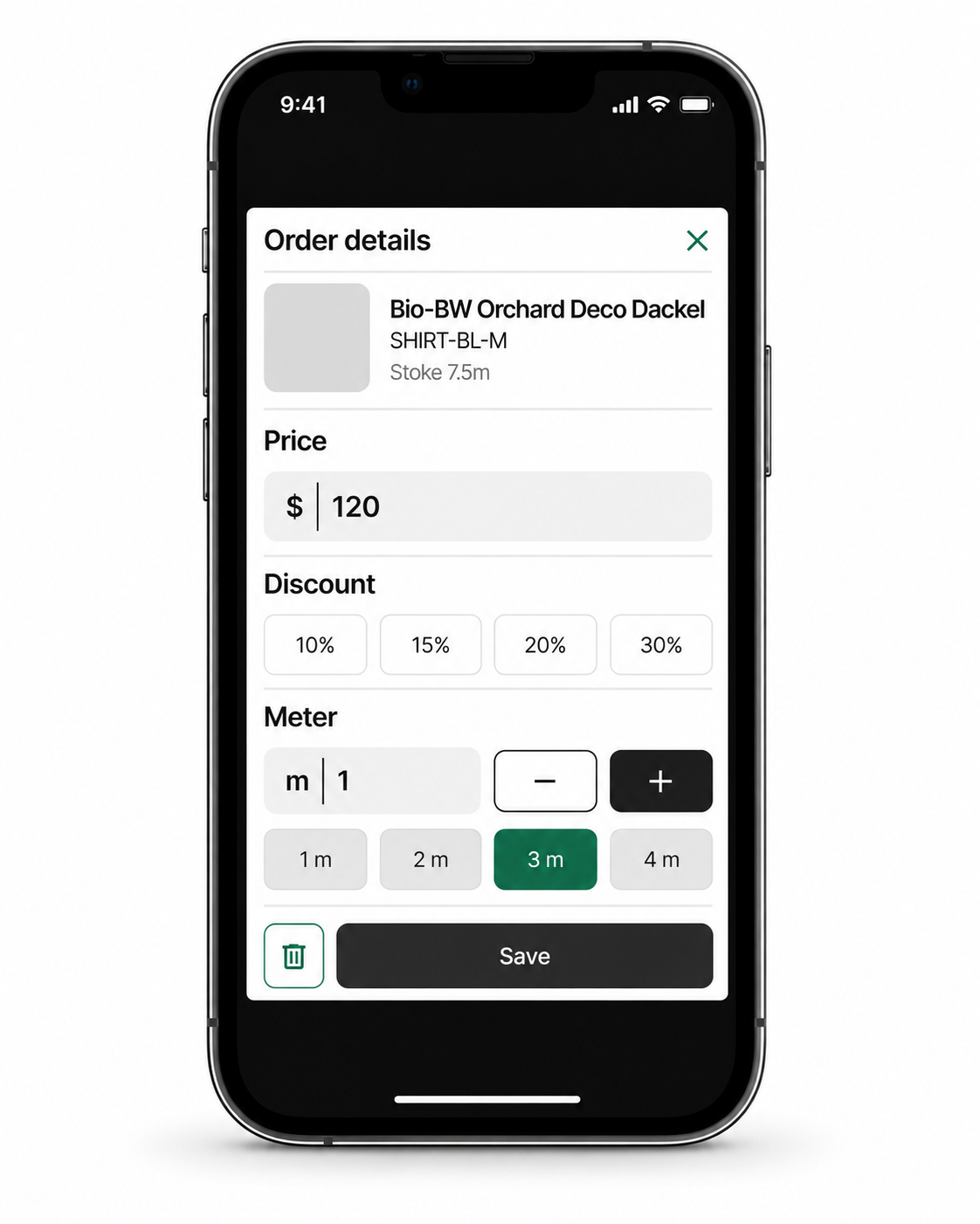
The back-office system already let products be marked as meter or piece during import. I proposed using that setting to drive quantity entry: length presets for meter-based products and standard quantity entry for piece-based products.
Trade-off:
The interface depends on correct unit classification during import. Responsibility for defining the unit moves into product setup, while cashiers retain control over quantities and prices.
QUANTITY CONTROLS
Observed
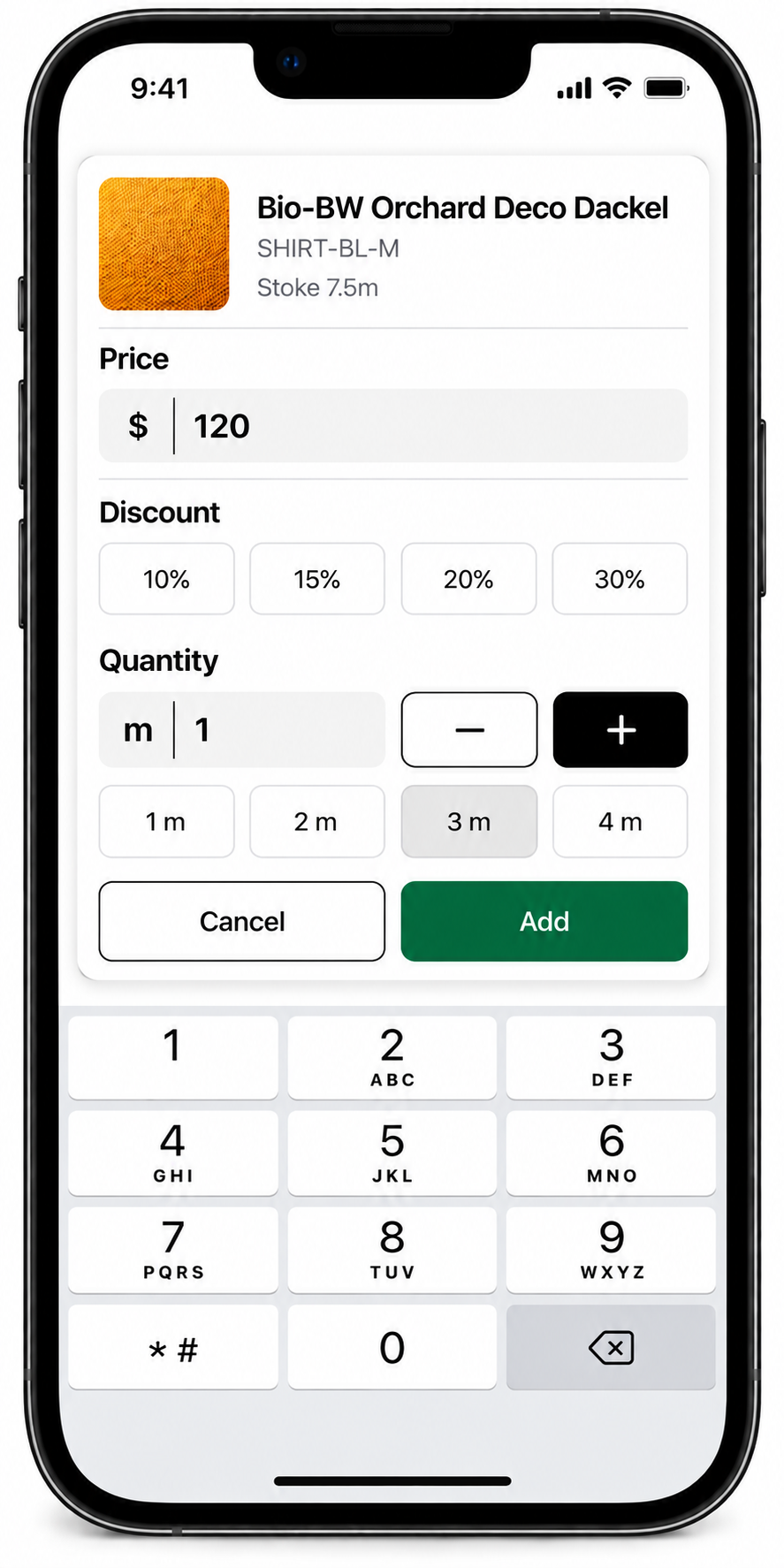
The minus and plus buttons were far apart, making the minus button difficult to reach.
Decision
I grouped both buttons beside the quantity field to make quantity adjustments easier to reach.

Method
I evaluated the checkout flows first in a prototype, then in the live version. Two cashiers from the shop participated.
GOAL
Evaluate scanning, retrieving a frequent product, applying a common discount, and completing checkout.
FINDINGS
Both cashiers completed the tested flows without additional guidance. During scanning, neither attempted to change the camera.
INTERPRETATION
The sessions indicated that these two cashiers could complete the tested flows independently. Completion time and accuracy were not measured.
ONE CONNECTED CHECKOUT FLOW
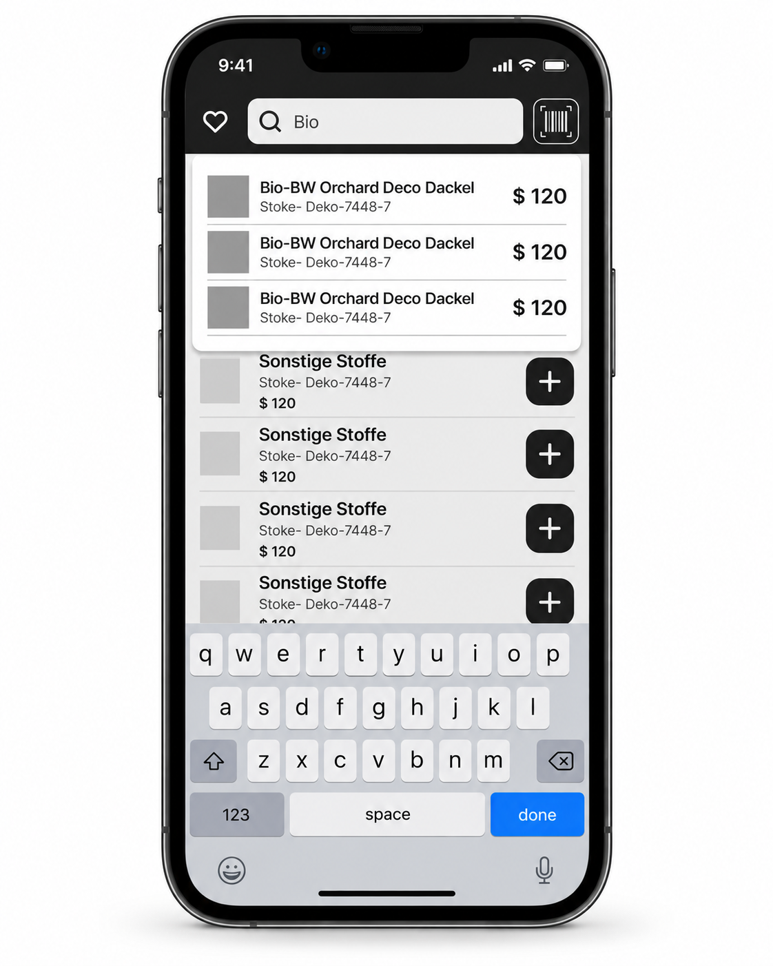
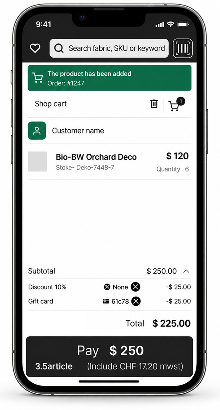
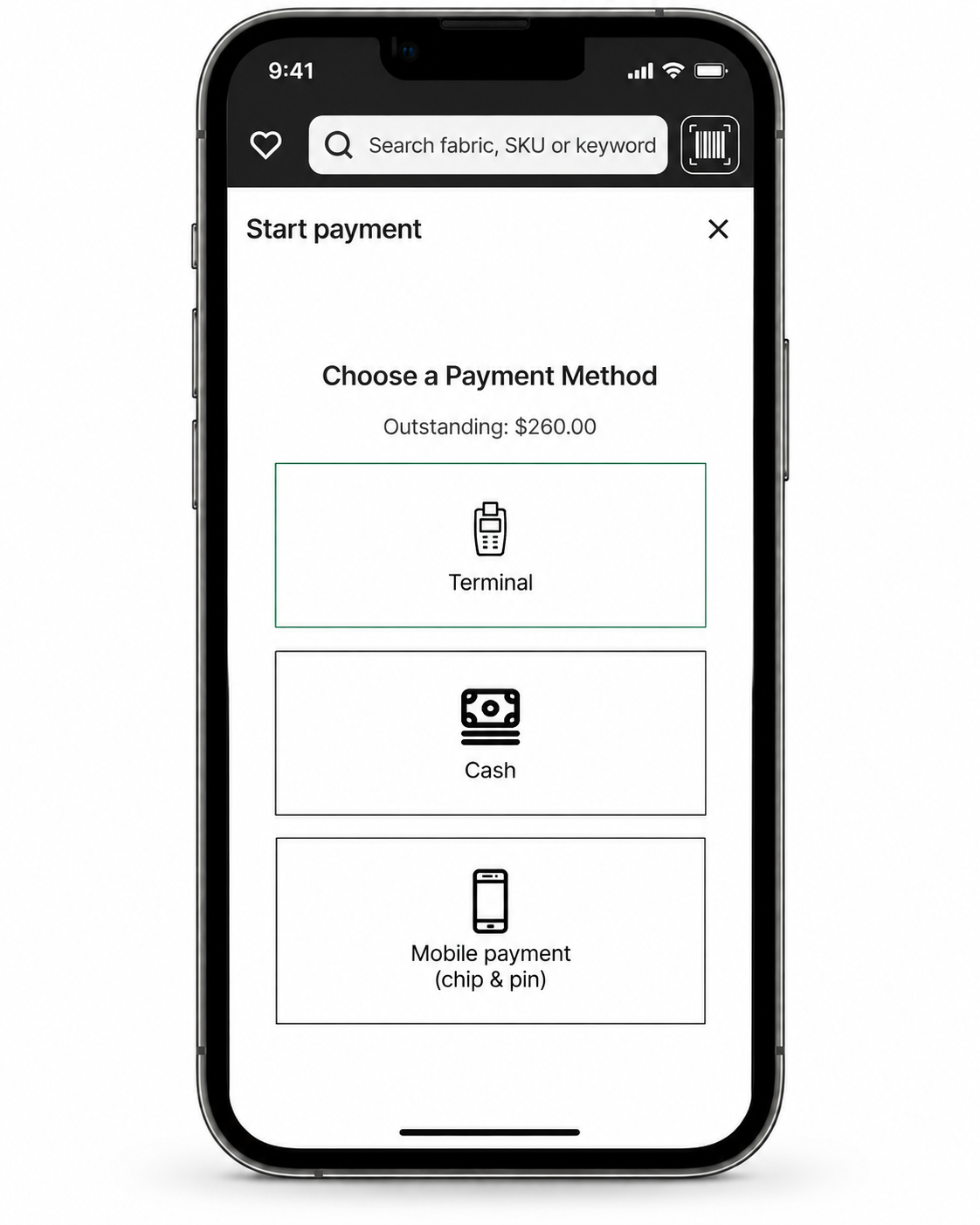
The redesigned interactions support finding products, building an order, adjusting prices, paying, and confirming completion.
- FIND
- BUILD ORDER
- CART
- PAYMENT
- COMPLETE

Transaction details
- Order ID
- Order #1247
- Payment method
- Terminal (Visa)
- Reference N
- 44240
- Date / Time
- 05 Sep 2026, 14:32
 Print receipt
 Email receipt
 Start new sale
View payment details
OUTCOME
The live version included direct scanning, Favorites, automatic totals, unit-specific quantity entry, and explicit payment confirmation. Routine calculations became automatic, while cashiers retained control over quantities and special prices.
WHAT I LEARNED
Frequency should shape hierarchy
Repeated tasks deserve direct access. Separating scanning from camera configuration helped me distinguish what cashiers need for every item from what they only need occasionally.
Automate calculation while preserving judgment
The shop’s flexible pricing required more than automatic totals. The design needed to handle routine arithmetic while allowing cashiers to adjust quantities and agree special prices with customers.
Decision
The back-office system already let products be marked as meter or piece during import. I proposed using that setting to drive quantity entry: length presets for meter-based products and standard quantity entry for piece-based products.